This page was generated from docs/tutorial/circle.ipynb.
Simulating the unit circle
Consider the following scenario. Let \(X\) be a dataset with two columns denoted by \(X_r\) and \(X_a\) respectively, each containing \(n \in [50, 100]\) values. The values of \(X_a\) are drawn from the interval \([-2\pi, 2\pi]\) while those in \(X_r\) may take values from \([0, 2]\).
Our aim is to find a dataset \(X\) that maximises the following function:
That is, a dataset which maximises the variance of one column and minimises the maximal distance from one of the other.
Such a dataset would describe the polar coordinates of some set of points along the unit circle where the points in \(X_r\) corresponds to the radii and those in \(X_a\) correspond to the angle from the origin in radians.
Formulation
For the sake of ease, we will assume that each column of \(X\) can be uniformly distributed between the prescribed bounds.
Then, to formulate this scenario in edo, we will have to create some copies of the Uniform class.
[1]:
import edo
import numpy as np
import pandas as pd
from edo.distributions import Uniform
[2]:
class RadiusUniform(Uniform):

    name = "RadiusUniform"
    param_limits = {"bounds": [0, 2]}


class AngleUniform(Uniform):

    name = "AngleUniform"
    param_limits = {"bounds": [-2 * np.pi, 2 * np.pi]}
To keep track of which column is which when calculating the fitness of an individual, we will use a function to extract that information from the metadata.
[3]:
def split_individual(individual):
    """ Separate the columns of an individual's dataframe. """

    df, metadata = individual
    names = [m.name for m in metadata]
    radii = df[names.index("RadiusUniform")]
    angles = df[names.index("AngleUniform")]

    return radii, angles


def fitness(individual):
    """ Determine the similarity of the dataset to the unit circle. """

    radii, angles = split_individual(individual)
    return angles.var() / (radii - 1).abs().max()
Given that this is a somewhat more complicated task than the previous tutorial, we will employ the following measures:
- A smaller proportion of the best individuals in a population will be used to create parents
- The algorithm will be run using several seeds to explore more of the search space and to have a higher degree of confidence in the output of
edo
[4]:
pop_histories, fit_histories = [], []
for seed in range(5):

    families = [edo.Family(RadiusUniform), edo.Family(AngleUniform)]

    opt = edo.DataOptimiser(
        fitness,
        size=100,
        row_limits=[50, 100],
        col_limits=[(1, 1), (1, 1)],
        families=families,
        max_iter=30,
        best_prop=0.1,
        maximise=True,
    )

    pops, fits = opt.run(random_state=seed)

    fits["seed"] = seed
    pop_histories.append(pops)
    fit_histories.append(fits)

fit_history = pd.concat(fit_histories)
Visualising the results
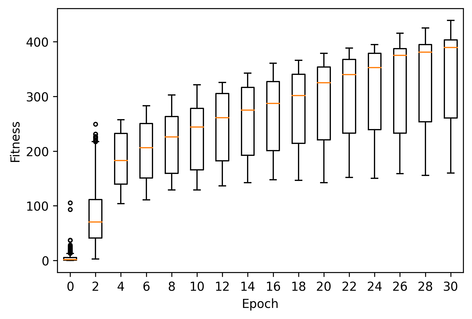
As before, we can plot the fitness progression across these runs using matplotlib.
[5]:
import matplotlib.pyplot as plt
[6]:
_, ax = plt.subplots(dpi=300)

epochs = range(0, 31, 2)
fit = fit_history[fit_history["generation"].isin(epochs)]

xticklabels = []
for pos, (gen, data) in enumerate(fit.groupby("generation")):
    ax.boxplot(data["fitness"], positions=[pos], widths=0.5, sym=".")
    xticklabels.append(gen)

ax.set_xticklabels(xticklabels)
ax.set_xlabel("Epoch")
ax.set_ylabel("Fitness")
[6]:
Text(0, 0.5, 'Fitness')
We can also take a look at the best individual across all runs.
[7]:
idx = fit_history["fitness"].idxmax()
seed, gen, ind = fit_history[["seed", "generation", "individual"]].iloc[idx]

best = pop_histories[seed][gen][ind]
seed, gen, ind, best
[7]:
(0,
 30,
 49,
 Individual(dataframe=           0         1
 0   1.005690 -4.928099
 1   0.971288  1.524298
 2   1.000057 -5.924903
 3   0.941059  2.931472
 4   0.984278  3.252393
 ..       ...       ...
 89  0.989021  4.615850
 90  1.022580  3.276894
 91  0.992919  3.266881
 92  1.027503 -4.978339
 93  1.004182  4.431548

 [94 rows x 2 columns], metadata=[Uniform(bounds=[0.93, 1.05]), Uniform(bounds=[-6.0, 4.74])]))
[8]:
_, ax = plt.subplots(dpi=300)

circle = plt.Circle((0, 0), 1, fill=False, linestyle="-", color="tab:gray")
ax.add_artist(circle)

radii, angles = split_individual(best)
xs, ys = radii * np.cos(angles), radii * np.sin(angles)

scatter = ax.scatter(xs, ys, marker=".")

ax.set(xlim=(-1.5, 1.5), ylim=(-1.5, 1.5), aspect="equal")
[8]:
[(-1.5, 1.5), (-1.5, 1.5), None]
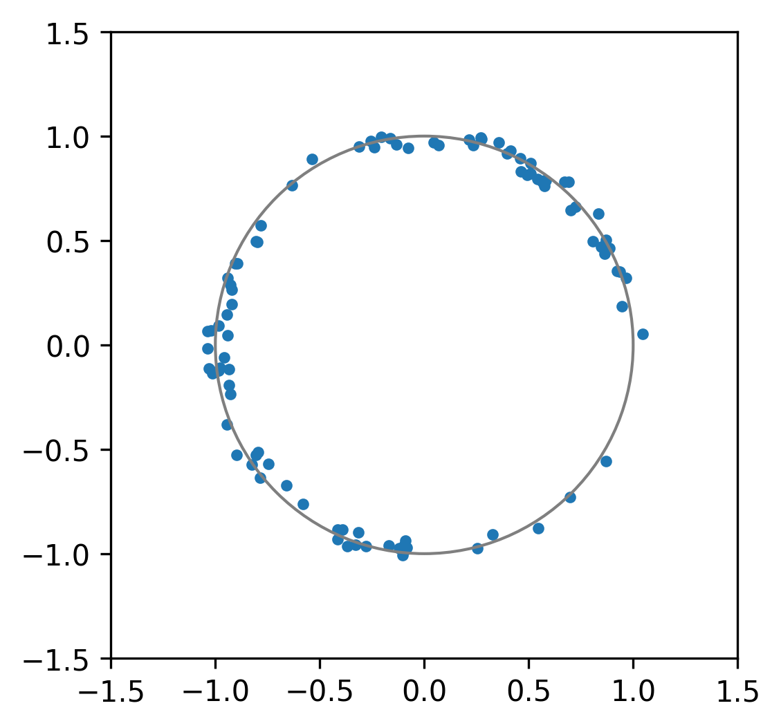
That’s a pretty good approximation to a circle. Nice.
Generated by nbsphinx from a Jupyter notebook. Formatted using Blackbook.